Sunday, 25 March 2018

ADVANCED PHOTOG (INKJET PRINTS)


For one of the tasks we were asked to print out two images on A3 photo paper of our choice. We had recently been inducted into these printers and the monitors and I was looking forward to printing. There was a lot more to remember than I thought and it took a long time to print. But firstly I went and got some photo paper from the print bureau, I decided to do some test prints too to male sure I was happy with how the image was printed and it was on the paper I felt suit it the best. So I switched the printer on, I did a nozzle check to make sure all the inks were topped up and ready to use. Then I opened the images, gave them a final tweak as we were allowed to use the expensive monitors for editing the pictures. The monitors allowed you to take in the light of the room and create a preset for you to edit in, based on the sunlight around you. We were asked to print one studio shoot image and one light source of our choice. I decided to print my light source first and got to work with setting the computer up ready for printing. You had to first select the size and orientation of the paper, then the type of paper you were printing on so that it could adjust the inks to the paper. Then chose if you wanted it colour metric or perspective. I chose for both images colour metric as I felt in my test prints that they came out the best in terms of colour. I put my paper in carefully, and decided to try and print on matte paper first. When it was finished, I had a look at the print and firstly it was far too dark, and secondly I wasn't as happy with the paper choice as I thought in the beginning. So I decided to go back into Photoshop, adjust the brightness so it would print more clearly, and I went and got some satin paper. I had to change the settings again in the printer view to ensure it knew what paper the image was being printed on. I was a lot happier with this result and pleased with the outcome so now it was time to print my studio shoot image.

I thought with my studio shoot image that I would like to print on glossy to give the image a glow and shine to the image. I got the printer all set up again, but making sure to change the type of paper the image was being printed on. I then set to work loading the printer to make sure the paper was the right orientation and going to print on the right side instead of the back of the paper. I then went for it and printed my image. I again chose colour metric because I felt the colours worked best for the images I was printing. It came out and I was actually super happy. The exposure was just right and I really like the way it looked on the paper. I was really happy with the image and because it came out perfect the first time I didn't feel like it needed another print on some different paper.


I hope you enjoy. Thank you.

ADVANCED PHOTOG (LIGHT SOURCES)


For one of the tasks we were asked to take photos of five different light sources. At first I was a little stuck as I couldn't think of five, but after having a talk with some friends I realised that there were loads. I wrote down what I wanted my five to be. I knew I wanted candlelight, as I have a lot of candles and felt I could compose the shot nicely. I felt also that maybe not everyone would take a picture of candlelight so it might be a bit refreshing to see. I am happy with this image as I feel the composition is executed well, as is the exposure. Luckily none of the images had to be portraits so that made things a little easier. My second image was daylight. I had taken this picture a while back when I was in my living room drinking tea, so I felt like this was a good one to use. I have edited it a little bit to get rid of some spots on the lenses and make it look a bit cleaner. But know I am happy with the result.The third image I took last winter when I went to a funfair. I feel funfairs at night are always great photo opportunities and am very happy with the result, for a shoot and go sort of shoot I was doing that day, I feel that the composition, exposure and lighting a really well done. My fourth image is a test shot I did in the studio of my friend Nina. We were playing around before any of our models came in and took a few pictures with Nina in the fur. I find this image very beautiful, mainly because of the model but also I feel the lighting, focus and exposure are spot on and I am actually very proud of the photo. Finally, my sunset picture. I took this when I went away last summer to Bristol, we were about to leave the apartment we were staying in when I turned round and saw the way the light hit the sheets and the bed and had to take a photo. This was also the image I chose to print as I felt it would look lovely and textual when printed on satin paper. I am really happy with all these images even if they needed a little work done on them. But having to do some editing on them has expanded my knowledge in Photoshop.


CANDLE LIGHT

DAYLIGHT

NEON LIGHT

STUDIO LIGHT

SUNSET

I hope you enjoy. Thank you.

ADVANCED PHOTOG (LIGHTROOM CATALOGUE)


As one of the tasks for Advanced Photography we were asked to create a primary and secondary Lightroom catalogue. We spent a whole lesson with Bayton going through step by step what was needed in our catalogues and how to execute it well. We were asked to create collections in our catalogues, give our pictures colour and star ratings, edit them, and give them keywords to search for in the search bar. Below I have taken screenshots of my work flow and pieces of editing I have done along the way.


Above you can see that I opened my image as a smart object therefore any work or editing I did to the photo, it linked back to my Lightroom catalogue, and inserted a new image with all the changes I had made to it.

As you can see above I created my 3 collections, and in my light source collection I had made a start on rating them and colour rating them. One thing Bayton told us in class is that a good work flow is to make all your newly imported pictures coloured red, meaning you haven't edited them, orange if you had made a start, and green when the image is complete.

Above is a screenshot of me demonstrating me opening an image as a smart object into Photoshop. 

Above you can see that when I open the image into the camera RAW view, I have made changes to how the image is imported and displayed. I chose 16bit for my image and changed the present from adobe to Prophoto.

You can see here that I am starting to make changes and edit my images slowly.

Again you can see the changes I am making to my image to make it look better.

Here I have taken a snapshot in Photoshop so that Bayton will be able to see what and how I have edited my pictures.

As you can see here I am showing you the beginning of my light sources collection, where everything is coloured red, and my star rating is how good I deem the image without any editing.

This is my personal collection at the beginning of me editing anything.

Again this is my studio shoot catalogue at the beginning of the editing stage.

Pictured here I am displaying that when you make changes to your image in Photoshop as a smart object it relays any editing back to your catalogue and creates a duplicate. You can also see in the bottom right hand corner the little icons show that I have created key wording for them, colour labelled and star rated them.

Here you can see my workflow as I start to make progress on an image.

I hope you enjoy. Thank you.


ADVANCED PHOTOG (STUDIO PORTRAITS)


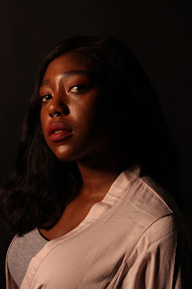
Approaching the studio shoot task I was a little nervous, as you have to get the lighting spot on in order to create broad or narrow lighting. In the lesson my test shots were really good, executed well and in focus and sharp. I think this was down to feeling comfortable and relaxed in the environment as Bayton was there. However, when we went to book a studio the week after to take our pictures. I wasn't very clever and left my glasses at home therefore all of my photos were blurry and out of focus. I was upset that these photos weren't to a high standard as my model was very beautiful too. But luckily I had enough time before the hand in just about to get back in the studio and re shoot. Unfortunately my model I had in the first shoot wasn't available, but I found another model that was just as eager. I got to work, but before that, put my glasses on! I brought in a silk dressing gown for my model to wear as I felt the fabric and colour was very feminine and would suit the style of photos. I then set up the lights, I first set up a soft box, but felt the light was a little too soft, so changed the head and went for a harder light. After doing this my photos came out exactly how and what I wanted, all in focus too. I directed my model as to where to stand, look, their posture and what to do with their hands. I feel the relationship between the model and myself was very relaxed and calm so she was easy and compliant when I asked her to change positions. Pictured below are some behind the scenes of the successful shoot.


APOLOGIES FOR THE BLURRY B.T.S PICTURES


PICTURED ABOVE ARE MY UNEDITED VERSIONS OF THE STUDIO SHOOT


Pictured above are the first studio shoot pictures I took. I feel the composition is executed well, however my lighting wasn't as good as it could have been and not all of them were in focus.


I hope you enjoy. Thank you.


Thursday, 15 March 2018

VFX TITLE SEQUENCE MAKING


I decided to set myself a day in the library to master the skills and tutorials I had watched in order to make my title sequence. I created a new composition and created a shape layer that would be the loading bar, then a box around it. With the loading bar I added a trim path to it so that I would be able to animate it, then edited the progression of the trim path and added easy ease. In the tutorial it gave an equation for the percentage of the bar to rise, I added the code however the numbers didn't go up at all. So I decided to delete the code and just add my own number when it got to 100%. After this was finished I pre composed the whole composition so I could start the next part of my title sequence. 

This part was the moving DNA piece. This tutorial was very intense and had to be stuck to very very closely, and I managed to do so. I started by creating two shape layers of circles and then duplicating them both to create masks for when they separated. I inverted the alpha matt for them so that when the circles drifted apart it seemed as if a bit of them was missing. I then creating a pole or listed Beam in the images below to create the piece that joined together the DNA. But in order for the circles and beam to keep together, I had to create a null object which was the rotation and parent all the circles and the beam to the null object. Then I keyframed how and where I wanted the rotation to happen and once I was happy with it, I then carefully keyframed so it appeared to come closer in the screen, even though all I did was enlarge the closest circle and decrease the furthest away circle. After I was happy with this then I pre composed this too and duplicated it, added roughen on the second duplicate to create a more motion blur effect then duplicated it some more so I could fill the screen and move them around. Attached below are some screenshots I took whilst working.


I hope you enjoy. Thank you.