Thursday, 9 March 2017

EXPERIMENTAL FILM IDEAS AND RESEARCH


After an initial tutorial with Anne after the pitches, we discussed absorbing everyday influences, from TV to pictures, to even the news and 'alternative facts'. We are in the process of learning how to glitch moving images, as we don't want to cheat and use an app. We would rather learn how to glitch moving images ourselves. I feel this won't be too difficult as we know the process of glitching still images so I imagine it is similar to this process.


I am so excited to get this film underway and get filming a colourful masterpiece, however I think our film needs a little bit of a structure. Danielle and I have been discussing the film, and Danielle has sourced some good research from websites and from the TV. We discussed that our film would just become an overload at the end. For the beginning of the film, we think it will look at old pieces of technology and maybe archive footage and start slightly glitching it, or changing the colours. Then as the film progresses more, then we enter footage we have shot of new technology and things or brands you associate with the digital world such as the Apple symbol. Coming towards the end of the film the glitching will get more frequent and brighter in colours and then we hope to get the film to appear as if it has switched off and loaded an error sign to show the meltdown of the internet and information overload. Danielle and I will take similar elements from our previously made short glitch film, such as the voice of god that was recorded from an online AI, which we both agreed was really effective. With a week to film we can get her to say things we want and cut and manipulate what she says to our advantage. I was thinking something else that could possibly look good and be effective in the message we are putting across is have 1 frame images or pieces of text, so that they're so fast it would be hard to see them, but the flashing images or text would set in the subconscious.


Image result for glitch images tumblr
Google Images

Image result for glitch images tumblr
Google Images

After doing a little research into glitch art and how other artists do it, I was intrigued by this artist who took his glitching to another level ' Databending ' This artist wanted to push his knowledge and skills on glitching and create meaning to the glitches which I think is quite beautiful. His process is quite intense, he takes apart digital cameras and attaches them to a circuit board to read and analyse how the camera takes the pictures, but he comes out with the most beautiful results. Here is a quote I feel is important about technology and the digital world that the artist said himself:

"I feel it's important not to allow technology as it's handed to me determine what I can say or how I say it." he says "it's the difference between letting the machine speak for you and you speaking through the machine"

I value this statement a lot and I feel it connects up nicely with the piece Danielle and I are producing, we are speaking through media and the machines we are using. We are almost manipulating the machines and changing their code to get them to say what we want. We shouldn't let the technology speak for us, we must have a voice within our technology too. 

More things to come 
I hope you enjoy. Thank you. 


Tuesday, 7 March 2017

MULTI SCREEN MOVING IMAGE PORTRAITS


Today we had the second After Effects workshop with Phil, and although I was unable to attend the first workshop due to illness I tried to get up to speed with everyone else. After Effects is a completely new software to me and is incredibly challenging, however I won't let this defeat me. Hopefully in my spare time I will resource intense online video tutorials to ensure I can complete the twin screen to my best of my ability. The brief for this twin screen is exploring the relationship between the human body and the digital world. When thinking about this initially I think of how apparent the digital world is, we are constantly connected through social media and our phones. It is so hard to switch off because we are accessible at all times. I have read many articles on how social media and the digital world effect mental health, and this is something I am thinking of exploring in my twin screen film. Some of the articles that stood out to me the most were these:

1. Effect of social media
2. Harmful digital world
3. Photos without phones

In one of the articles it has two interesting statements about social media being an easy escape to escape from the real world and hide away, claiming it could become an unhealthy obsession. The other interesting statement claims that it can be a positive thing for shy or anxious people to be able to communicate with people in a way that feels safe for them. I quite like these two opposing ideas, and possibly could develop into a twin screen idea. Another of my links is an article about a photographer who simply PhotoShopped peoples mobile phones out of pictures, the end results looked so strange these people hunched around a little bit of light from the phone, and seeing the antisocial behaviour. This interested me as I could maybe develop an idea of life without technology and social media. But I would prefer to display these ideas as visual metaphors rather than literal, as I feel this will create a more aesthetic look to the twin screens. I want to definitely explore nature footage somehow into my film using cut out shapes and layering in After Effects.


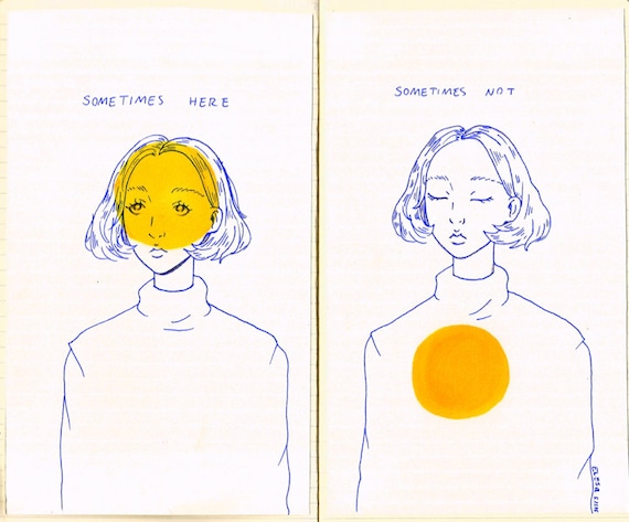
Image result for sometimes here sometimes not

Here is an image of an online artist that I like the work of, I want to take inspiration from the composure of this piece, and want to see if I could mask out where the yellow circles are and have film playing in the background.


 I am still in the early staged of developing an idea.

I hope you enjoy. Thank you

Thursday, 2 March 2017

EXPERIMENTAL SOUND FINISHED PIECE


For the experimental sound piece we were asked to create a soundtrack between 30 seconds to 1 minute inspired by a piece of artwork. Previously I explained I chose Francis Bacon's art piece and took inspiration from Eraserhead by David Lynch. I wanted to achieve an unsettling background piece with some unusual sounds breaking the white noise. I feel I achieved what I wanted it to sound like and I am quite happy with the end result.

I wrote up a list of sounds I wanted to record such as running water, squeaky doors, rice shaking and fingers clicking. After recording these I imported them all into Audition and decided to graphic equalize most of the sound clips with either 20 or 30 bands. Then attach convolution reverbs to most of sound clips. I used effects such as massive cavern to create an echo or backwards cavern to make it sound unnerving. I created a few tracks just as background noise to try and take my own approach on Eraserhead and then added in little snippets of other uncomfortable. I then had a few tracks to add in the uncomfortable sounds so they could fade in and out with the background noise. I feel with the steaks in the painting it inspired me to drag the sounds out to replicate the paint marks. Overall I am quite pleased with my end results as I feel it fulfilled my interpretation of what I thought the painting sounded like which was to create an uncomfortable ambient background.


Here is a screenshot of me exporting my sound piece at 24bit and 48khz and turned down the master track to -3 so it was at the right levels and formats to be submitted. I feel I picked the right painting for me as it gave me lots of sounds to explore and be adventurous with my sound manipulation.

Here is my finished experimental sound piece:


I hope you enjoy. Thank you. 

EXPERIMENTAL SOUND RESEARCH


As I have decided to select the painting Pope Innocent X I wanted to research sounds that could inspire me to create my own experimental soundtrack. In lesson James showed us a classic Lynch film Eraserhead (1997) When watching it I loved it. I loved the atmosphere it created, and the apparent static noise in the background that was so loud but after a while just merged into the background. I enjoyed how uncomfortable, claustrophobic and tense it made you feel. So when recording my sounds I tried to source sounds that could create an atmosphere similar that I could make my own. So I manipulated the sound of running water and squeaking doors to try and create this uneasy atmosphere.

Eraserhead (1997)

I hope you enjoy. Thank you. 

FINAL SELECTED PORTRAITS: FIORIRE


Here are my final portraits for the Identity series: 

Stripe

Mint

Time 

Quiet

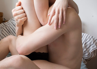
My motivation for this series of portraits was quite simple. I adore the look of skin on camera, capturing it in just the right light to make it look so soft and beautiful. I also wanted to capture my relationship between my partner and I. I wanted to show our intimate moments together without it being sexual and just with very carefully selected lighting. I chose to only shoot between four hours of the day (10am-2pm) to achieve the soft light I achieved in my photos. Also having a photo of my partner and I individually I wanted to show that we are individuals too, and that we come together and a unit. My initial ideas we to shoot my pictures candid and just have my camera ready at any moment we were together. However, I wasn't getting fast enough results or what I really wanted, so Anne suggested that I stage the photos so I can control everything and make the appear candid. I decided to give this idea a go and my results were far better and was producing more work. I quite enjoyed controlling the seemingly candid photos as it meant I had full control of composure and lighting and this gave me satisfaction that the photo would turn out well. I wanted to highlight through post production the places in which our bodies come in to contact to enhance the senses of we we touched. 

For my research I wanted to find some work of a similar nature to mine and I looked in the book Auto Focus I found a series named My Little Dead Dick which was a collaborative piece between Patrick Tsai and Mdi Ju. The collection is simply gorgeous as they photograph their intimate time together. I was so inspired by their work I wanted to try and get a similar candid look with my photos. However, one strong difference between their work and mine is that they used film photography to create the beautiful saturated colours. I just loved seeing how strongly you could feel the intimacy in the photos without it having to be sexual. Another photographer I researched was Igor Prorrt. A friend of mine saw his work and recommended him to me, and specifically a series named Betelgeuse. Upon looking at his website filled with his work I fell in love. The lighting in his photographs was beautiful, so delicate but so soft and touching in the series. On reflection of these photos I learned and can see he used a lot of artificial lighting to create these wonderful shots, but I still adore them and their composure. For portraits they are quite unusually composed, he often has his face away from the camera and close ups of body parts with him and his partner. I liked the uniqueness to his work and took inspiration for my photos in composure and lighting.  

When shooting my photos there were some challenges, it wasn't all an easy ride. For instance, when photographing the picture of me in the bath I had to try and make sure you couldn't see the reflection of the camera in the side of the bath. I saw this as an issue and framed it so you couldn't see it. Also with the photo of my partner across my lap it was hard to take the photo as I was having to hold the camera from above and hope for the best, This meant we had to take multiple shots in order to get the framing exactly how I wanted it. For the portraits together brought new challenges. The photo in the bathroom I wanted to show there was a mirror behind us but not get the camera in reflection,so I had to frame this carefully and position us so we would block the camera's reflection. For the photo of us on the bed, I had to set the focus and desired framing with my partner in shot, then press the timer on my camera and run back into shot. This meant we had to take quite a lot of photos before I was happy with one, but it was worth it in the end. We also had to balance the camera on a radiator which was switched on so time was of the essence. I also had to settle on a name for the series and that brought new challenges because I felt I couldn't simply sum up the series with a title. However, I took my time thinking and researching and settled on naming the series Fiorire. Fiorire means to flourish or to blossom in Italian, and since I have Italian in me and in my family, I felt this was fitting and gave a new intimate level into my life and the series. 

In terms of post production techniques, I set out with the idea that I was going to select the places in which we came into contact with each other and alter the hue. I personally felt this would look good and give good results because it would draw the viewers eye to the colour change in parts of our body to make you think about the touch and contact we have, enhancing that feeling of intimacy. However upon doing this in PhotoShop I wasn't happy with the results as they ended up looking alien like and taking away the natural intimate feel to the photos, which is what I wanted in the first place. So I spoke to Anne and made the decision to submit the photos as they were as I felt happy with how they looked, manipulation free. 

Personally I have thoroughly enjoyed this portrait unit, I liked the freedom of producing more than one photo and how creative we were allowed to be. I feel there are many strengths in my series as I took a lot of time and hard work creating and selecting them. I made the decision to start taking photographs as soon as the brief was given to us, so this allowed me plenty of time to get the results I wanted without being under the pressure of time. I am also quite proud of my lighting too, I feel even though I am very strict with the times I shoot in the day it really does pay off for me. I see good consistent results by being very strict with my shooting routine. Also with starting to photograph in plenty of time this gave me more flexibility when it came to framing as I could dedicate the whole four hours to achieving one photo, so I could move slightly left or right and get it just perfect. Being a perfectionist I feel this is the way I should start working in future project so I have enough time to really perfect my work. I feel I achieved what I set about doing in my series from the beginning. I personally feel and see intimacy in my photos even if I was a viewer and not just the producer of the work. I feel you can see a connection between my partner and I that is intimate and loving without being too overpowering. However, there are always areas to develop on in any piece of work. I feel I could develop, explore or expand my series by trying out a whole shoot on film camera. As my initial photographer research was on a whole series just shot on 35mm film, I feel I could have done this and seen if my results looked as saturated and warm as the photos I researched. I have always been a bit afraid of photographing on film as you don't have the reassurance that you can check to see if the photo looks good. But I feel I should push myself more and try it out, even if all the results weren't what I wanted, at least I could show that I had tried. I am considering using just film cameras if we have another portrait series to really challenge my skills. 

Overall though I have learned so much from this unit of work, I have learned even more on composure through research into other photographers, I have explored and perfected my lighting through research and experimentation which will help me in any future photography.I have also realised the importance and significance in series of photos instead of just one and how it can tell a story and give the photographer and audience more space to explore running themes through the photos. I have also learned how to mount on foam board which I have never done, but will do again as the results give a beautiful finish to my work. 

I hope you enjoy. Thank you. 

MANIPULATED PORTRAITS


With this portrait series we had to manipulate the photos using Photoshop. So I thought about what I could do on Photoshop that would enhance my portraits. As I have used only natural lighting in my portraits I wanted to let in a bit of colour to maybe draw attention to a certain element of the photo. So I came up with the plan of selected points on my partner and I's body that came into contact with each other or something else. However, my skills on Photoshop are very limited as I have only used the software a handful of times, so had to do some research before so I could create the look I wanted without my skills stopping me.


I imported the photos into Photoshop and selected our hands and parts of our arms that were in shot and adjusted the hue so it was a lilac colour. I chose this colour because it is quite soft, subtle and not to overpowering in the photo. I decided to manipulate the photos in this way because I am trying to display the emotional and physical affection, I wanted to show the points of contact my partner and I feel the most when we are together. In this picture it happens to be with our hands, the feeling of running your fingers over someones skin is unexplainable and just wanted to highlight that in the photo. 


With this picture I decided to highlight my hands to enhance the senses. As sensory stimulus is so important to everyone and i feel it so intensely in my relationship. I decided to choose the same colour as to make sure that there is a continuation and link between the photos and what I have done to them. Sometimes feeling something through your fingertips can change the way you feel, such as hot and cold things or things that make you calm. 


I carried this process over to this photo too with the same colour. I am not as happy with this photo and my manipulation with it because I feel it distracts you from the image instead of enhancing it. 


With this photo came new challenges because our hands weren't in shot. But nevertheless I worked my way around it. I decided to highlight and change the colour of my knees as that was the point of contact visible between my partner and myself. I am not quite sure if I enjoy my manipulation in this image as I feel it takes all naturalistic qualities and intimacy away from it. 

I thought about possibly changing the highlighted pieces in the images to black and white instead, but I felt like that would bring a negative feeling to the picture. i felt that colour would make it appear more positive but I am unsure as to weather I chose the right colour. After exploring manipulating my images I have decided to submit, print and mount my portraits with only a little touching up on exposure and not with the change in hue and selection. This is because I feel the manipulation takes the naturalistic look and intimate feel away and focus on the colour which wasn't my aim. 

I hope you enjoy, Thank you. 


Monday, 27 February 2017

EXPERIMENTAL FILM PITCH


Danielle and myself have decided to collaborate for the experimental film task. The reason being is that we enjoyed working together on the mini film about digital materialisation. We also found we had lots of similar ideas for style, lighting and colouring in films. I am proud of the short film we made together and have decided to expand this piece into a longer more in depth experimental film.

The film has a theme of Transgression. As I didn't know what this word meant I decided to look it up online. Here is what I found:

Transgression
trɑːnsˈɡrɛʃn,trɑːnzˈɡrɛʃn,transˈɡrɛʃn,tranzˈɡrɛʃn/
noun

  1. an act that goes against a law, rule, or code of conduct; an offence.
  2. "I'll be keeping an eye out for further transgressions.

At first I was a little unsure of how we could link our short experimental film to this idea, but discussing with Danielle we came to some ideas. We also discussed previous works we had watched in lesson for inspiration of a style or look we were going for. Here were some of our inspirations:

Berlin Horse - Malcolm Le Grice

We drew inspiration from this film because of the colouring, Danielle and I have a fascination with colour and want to use lots of saturated colours, this film certainly has that. We also liked the repetition of the clips and music as it was almost hypnotising and that's what we want to try and do with our film but in a more digital way. 

Black Ice - Stan Brakhage

This was another inspiration of ours as it used such beautiful colour saturation and layering. Danielle and I enjoyed the calmness of it and the hypnotic feel as it draws you in more and more. Again with the same theme of Berlin Horse, we enjoyed the repetition as it created a sense of known and security and that is something we could think about playing with in our film. 

Pipilotti Rist - (Entlastungen) Pipilottis Fehler 

We were shown this piece in class and instantly we found inspiration. The colour, framing, lighting and all of it we enjoyed. We especially enjoyed the colour and the interesting underscore as we also want to play with music and manipulate it and make it sound as uncomfortable as the visuals. We both really enjoyed this piece and took notes on how striking the colours were and may try and explore them too. 


CONCEPT
The concept of our film is to build on the theme of transgression and materialisation as we really got a lot enjoyment out of exploring it before. With the theme of transgression we want to explore the ways media can break rules and the law, and confronting codes and conventions through the ever growing digital world. 

TREATMENT
Theme
Exploring materialisation in the digital world today, reflecting from previous examples such as Berlin Horse and Pipilotti's Mistakes.

Visual and Editing Style
Lots of fast cutting, manipulated images, glitching, colour and chaos of visuals. Bright colours to draw your eyes in and manipulated images to draw you in.

Inspirational Artists and Filmmakers
Malcolm Le Grice
Pipilotti
Nam June Paik

Artists we have explored independently
Luke Jerram - sculpture glitch artist https://en.wikipedia.org/wiki/Luke_Jerram
Mathieu St-Pierre - digital film and image glitch artist https://en.wikipedia.org/wiki/Mathieu_St-Pierre
Neil Krug - Photographer http://www.neilkrug.com/
Sabato Visconti - image glitch artist http://www.sabatobox.com/glitch-photography

Intended audience and mode of viewing
Personally I feel this film's intended audience would be for young adults to fully grown adults. This is because while there won't be any bad language in it, the scene might be a bit too intense amd overwhelming for a younger audience. Plus the abstraction of it all may be a bit hard to follow for a younger audience. I personally feel maybe young to fully grown adults would be able to connect with the film more as they have grown up around technology and it shaping our lives today. The intended mode of viewing I think would be for the film to be screen in a dark room with the film playing on the ceiling. The audience would have to lie down and there for be below the 'Voice of God' playing through the film. The audience would subconsciously submit to the film. Also the vulnerability of lying on your back allows the audience to be absorbed.

I hope you enjoy. Thank you.