Wednesday, 18 October 2017

INSPIRATION - MAPS AND NETWORKS I


With our maps and networks idea well under way with the pitch fast approaching, we feel we can constantly be inspired throughout our film process. One thing I enjoy about our course is that we are encouraged to find inspiration in every types of media and form of art. Danielle stumbled across an illustration artist online called Kine Andersen. Even though we are doing a moving image piece, Danielle and myself are constantly taking inspiration from everywhere; Tabloids, moving image work, photography and illustration. Attached below are some illustration pieces we were inspired by in terms of their colour pallet, and feminism elements.

BITCH

DISCOVER YOUR FUCKING FLOWER

LOVE YOURSELF

SORRY BABY

I adore illustration work anyway, as I am fascinated by the colour pallet people use and the simple line drawings. So I tried to find some illustration work that related to what our piece was about. Danielle came across this artist, who does simple line drawings and liberates women in their own bodies without sexualising them. I am always a fan of work like this as I feel men would find it hard to make art liberating women without exploiting them or offending them. I adore the liberation in these illustrations and how much power the women have in them. I am all for seeing strong women standing powerful and in control, and I feel these illustrations are a great example. Even though we are not doing an illustration or animation piece, I feel this is good inspiration for colour and potential framing for shots in my piece.

I hope you enjoy. Thank you

Tuesday, 17 October 2017

MAPS AND NETWORKS PITCH


For maps and networks myself and Danielle have decided to work together again, after digital materialisation that went so well, with great feedback, we felt that working together again would be beneficial for our work and grades. Previously we have had very similar ideas for style, themes and colour pallet. With maps and networks we found that we drew similar ideas from the title and decided it would be a great idea to collaborate again. With our schedules, filming and editing being so on time and accurate I felt that time management is one of our strong points with working together.

This installation piece has a theme of maps and networks. After spending a few weeks exploring artists that had literal and theoretical themes surrounding maps and networks, myself and Danielle selected artists we felt were relevant to what our idea represents. We called on our first year knowledge and sourced out Bill Viola as research as his Martyrs piece was a classic example of a well executed multi screen piece to do with the elements. Another source of knowledge was Jemima Stelhi, with Performing for the Camera. We liked the feminism elements from this piece and felt it was strong and relatable to our idea. We especially liked the themes of forcing men to be aware of what they want as she took her clothes off in front of them and made them uncomfortable and aware.

CONCEPT 

The concept of our piece is a twin screen moving image piece. The piece has surrounding themes of feminism, female invisibility and female body positive culture. We feel a twin screen is best for our idea as we can display two feelings and themes at the same time so the audience is made aware of what we are trying to say. On one screen we shall have a woman in a red bath trying to call for help underwater. This is because we feel that often women don't have a voice in the work place, the creative industry and medically. Women are often told to appreciate cat calling as a compliment instead of the cat caller being called out, women have to carry that fear and those comments around. When we do try and speak up for ourselves we feel we are ignored and not taken seriously; Hence the woman underwater trying to call for help. The red colour of the bath water has many connotations to us. Such as, erotic and sexual connotations, femininity, periods and the anger of being suppressed. The erotic and sexual connotations of red roses, lipstick, Valentine's Day, lingerie, sex, danger and erotic kinks. The femininity elements of red are romance, roses, nail varnish, "a well kept woman" sexual desire and menstruation. Menstruation is a key theme with the connotations of red for women, being such a natural part of a woman's life yet turned against her as being unclean, disgusting, shameful and impure. Also the fact that tampons are seen as a luxury item and not taken seriously as an essential item in a woman's life just goes to show that women are oppressed.

On the other screen we will have a women sat on a red sofa with the main shot being of her naked torso. It will be a mid shot of her on the sofa with her boobs out and her legs crossed so you can't see between her legs but you know she is naked. Within this shot you will be able to hear her talking about important topics, current affairs and women issues with her head out of shot. The reason for this shot is linked to Jemima Stehli's work of showing the audience exactly what they want, but making them uncomfortable about wanting it. This also links to the male gaze, as often films are filmed from the male perspective therefore automatically sexualise the female form. Every so often the shot will change to cut to her face, in which we can see stained red lipstick and mascara that has run down her face, showing that she is uncomfortable about being naked for the audience. However we will make sure that the actress is comfortable being naked on camera. The red of the sofa and her lipstick links with the red bath and the connotations of female oppression and sexuality. This then confirms to the audience that the two screens are linked.

CONTEXTUAL UNDERSTANDING

We want to create a film that relies on contextual understanding of women's problems and vague but suggestive shots for the audience to interpret by the audience. We have used video and photographical artists as our research but feel we are branching out and creating something original.

Our concept is to demonstrate and display how women feel in the media and everyday lives, constantly being sexualised. We want to explore how voiceless women feel, how they are shamed for their bodies, yet also sexualised. We will be taking influence from the few weeks of being exposed and shown different artists and how that can affect our work and the meaning to it. Our aim for this twin screen is to educate people on how women feel and make the audience aware that we are human beings not just a sexual item there for your pleasure.

TECHNICAL AND CREATIVE SKILLS 

For this production we will be filming on a Canon 700D. This is because we will need to get close intimate shots for our film and feel a 305 will be too big and in the way. Using a DSLR also gives us the options of changing lenses to a prime 50mm lens for a shallow depth of field. We will also need a tripod as we want to keep our shots as still and consistent as we can, therefore excluding any continuity errors. We will then take the rushes into premier pro and start to edit them as seperate screens. After we are happy with each screen we will then take them into After Effects and start to colour correct and add any effects we think will enhance the piece; After we have done that we will then combine the two screens. We are not expecting to add any effects other than colour correcting but ideas develop all the time so we may end up using some. We could potentially enhance the red on both screens as to draw the audience to our piece.

SELF MANAGEMENT 

As proven in previous project Danielle and I been very good with self management, communication and schedules. Our pre production is always filled with time plans and schedules to make sure we are allowing enough time for filming and editing. As for communication, we speak very often and always update each other on what research we have done or blog posts so we are both up to speed with the project. With self management, we have always made projects that we are passionate about therefore self management is easy and enjoyable as we want to see this film blossom. Throughout the process we will constantly update our blogs on more research and how the process of the film is coming along to ensure we have solid documentation of the film and its process from start to finish.


Thursday, 12 October 2017

MAPS AND NETWORKS IDEAS AND RESEARCH


We have been given the task of producing a piece of work that has connotations and links to the title "maps and networks" As this is such a broad title, where you could link any work I struggled to come up with a solid idea. Having so much creative freedom with projects is such a blessing and a curse. My imagination went directly into analysing maps and networks and what they mean to me. Of course the first thing that connected with the title was physical maps, geographical drawings, social networks, networking events etc. However, as a perfectionist I didn't feel creative enough just simulating an idea stemming from what I had originally interpreted the title as. I set the idea aspect aside, and decided to do some research of my own into video artist and photographers that inspired me in one way or another.

Reflecting on previous lectures and presentations throughout first and second year a few artists stick out for me in which i adored their work. Firstly Jemima Stehli. Her series Performing for the Camera captured me instantly. I am forever fascinated in voyeurism, the male gaze, female oppression and this was the perfect series for me to look at. In this series she sits art curators down, tells them they can take the photo when they feel uncomfortable as she undresses. The whole series includes many different uncomfortable looking men holding the shutter as she is naked, getting undressed, or even with her clothes on. As much as I enjoyed this power play, in giving men the thing they want so bad and making them self aware and uncomfortable, I found flaws in this series. Instead of liberating women and their bodies being sexualised I feel she just reiterated the stigma. I enjoyed her thought behind her series, as to show men that on the screen that they watch explicit videos on, there are real people behind it. I found this theme intriguing and will hope to explore this more in my maps and networks work.

Performing for the Camera

Performing for the Camera


Another artist for me that comes to mind is Bill Viola. His use of the elements and his multi screen work really interests me. Doing multi screen work in first year made me realise how much more you can show and portray in more than one screen, I like the look of multi screens and syncing them together is something I find satisfying. As a class last year we had the pleasure of going to St Paul's cathedral to see Martyrs. This is a four screen piece that focuses on the elements and the human body. All screens work together and are in sync as the people are subject to the four elements. I felt this piece was very moving yet calm, as you watched how peaceful and also how damaging the natural elements can be. I like the idea of exploring how elements can exist alongside human beings and the impact they have on each other. I also enjoyed how calm the piece was despite what you were watching. I feel I can link Stehli and Viola to support my idea for maps and networks.

Martyrs 


This leads me onto my idea for maps and networks. I have decided to create a dual screen piece, with one screen me underwater trying to scream for help and explain my problems. This has a subliminal message of me not feeling like I have a voice in terms of being a woman, an a patient of the NHS and mental health. Showing that I don't have any say in my life and speaking up for myself. As for the second screen, I haven't decided quite yet. I have a few ideas such as the other screen being a series of everyday activities made sexual because it is with a naked woman's body. This could create interesting contrast as one screen I am crying out for help and no one can hear me, but on the other screen I have everyone's attention because I am naked.

I hope you enjoy. Thank you.


Tuesday, 10 October 2017

ARTIST RESEARCH - BRYAN M FERGUSON


This summer I have been trying to expand my knowledge on artists as I didn't have any time to be creative. I am forever obsessed with artists colour pallets that are pastel, or bright and intense. I have recently been getting back into film photography and the look and feel from film photography you can get is a lot different to digital. I have often found that different film such as portra 400 gives a different look to superia 400. The colour pallets are so varied yet so encapsulating.

This leads me on to my artist research. In class, a classmate showed us an artist and his video work. His video work was bizarre, beautiful, obscure and truly different. He produces lots of short films that seemingly have no correlation to each other. Curious with his work I researched more. I found his website and discovered that he also did photography work. They are just as beautiful as his video work. Underneath I have attached some images:

WRAPPED IN PLASTIC

HIS FEARFUL SYMMETRY 


DR. MONSTER

VULGARIUM

The colour pallet in these images are incredible, I love them being so vibrant and colourful. I am unsure of if they are film photography or not. I enjoy the framing, exposure and composition. I would love to try something similar with gels in a studio. Although I would question what the meaning of these images, but like these images they may not need to have any meaning.

I hope you enjoy. Thank you. 

Tuesday, 26 September 2017

ARTIST RESEARCH: SHIRIN NESHAT


Shirin Neshat is an Iranian born artist, with running themes of juxtaposing ideas in her work. Some of these themes include, Islam and the West, femininity and masculinity and public and private life.

During first year, we were shown some of her work, photography and video and it had an incredible impact as it has such deep and political meanings. One of her most famous pieces of video work that I enjoyed was Turbulent, this is a dual screen piece in which we watch a man sing what I assume is a traditional song, with a full crowd watching with his face to the audience. On the other screen is a woman, singing what can only be described as sounds, which seem to not sound like words, facing the audience with no one in the crowd. This is displaying Identity quite clearly. Neshat also has a lot of work around the oppression women feel in Iran and this is show in Turbulent. The man on the left screen is singing with a crowd listening; whilst the woman, has no one in the audience and isn't saying any words, almost as if she isn't allowed an audience to voice herself.


Neshat also does photography work and has created some wonderful and moving pieces of imagery with some calligraphy work too.  She created series of images that are sacred parts of peoples bodies. Such as their faces, hands for praying, and feet for walking on. These were shot in black and white to display the hardship and depth of what Neshat is trying to display. As she is well known for her political and identity themes I feel this is displayed very clearly through these three images. Showing that your identity is what you say and your religion and that it is displayed on your body. Having words from the Quran on your face is an incredible political statement and one that could liberate women in Islam which is what Neshat is trying to do. 


Monday, 18 September 2017

SUMMER PROJECT


For the summer we were presented with a project to plan and develop an installation to have a politically aware agenda. I decided to base my installation around mental health and the seemingly unknown hidden life about it. Struggling with it myself, I feel I am not taken seriously by doctors and the NHS of everyday symptoms and how it can drastically change all aspects of your life. Of course, if you had a broken leg, a visible injury, then you would be seen to straight away at the hospital to get it fixed. However, I feel because mental health suffering is often primarily internal, you are not taken seriously as know one can see inside as to what is going on. 

Anyway enough about me. I found some incredibly moving and touching photography surrounding the same themes and ideas I was looking at and felt like this could inspire my own work and instillation. The artist is called John William Keedy and he has produced a series of work that resonated with me particularly, it is titled "It's Hardly Noticeable" I would like to share some of the images with you know and explain why and how they resonated and inspired me.


All four images are from the same series. What I like about them so much is that they are subtle in showing displays of suffering. If you just so happened to see these images without knowing the meaning and title behind the series, you wouldn't associate them with mental illness and suffering. What I like about these pieces is they're very unique. Many artists who try and capture mental health, often tackle it head on with images of people appearing sad, or in black and white and things of a similar nature. However William Keedy has captured life in colour, and shows the everyday struggle of mental illness and sufferers trying to go about their daily life. They show a sense of overwhelming things that seem trivial to someone who doesn't suffer. Having to remind yourself to be good as you leave the door as reassurance against your mind that wants to battle you. Overwhelming things being delivered or trying to be contacted when all you want to do is shut yourself away. 

I feel that these sorts of images would be best displayed in and around a city, on sides of buildings or posters. I feel this kind of abstract but relatable imagery to those who suffer could be reassuring and liberating that they're not the only people who feel overwhelmed by everyday life. It could hold a positive meaning and where lots of people come and go everyday can see it. This could liberate the stigma I would hope, and allow people to talk about their everyday suffering which is still a big part of people's lives. 

I tried out some of my own images that inspired me looking at this work. I feel my results were less abstract that William Keedy's but I still gave it a go. Below are the images I took:


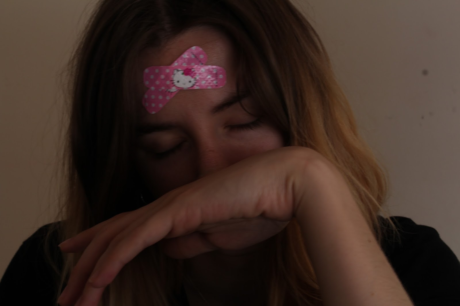
Although I feel these didn't the abstraction of William Keedy's work, I feel I created my own meaning from what I felt when I looked at his images. I composed my photos the way I did to ensure my head was in full shot to show where the suffering originates from in my body. Plus the fact that I have comical band aids on my head shows that my internal suffering isn't taken seriously and is a joke. In the first image I show only my forehead as I feel sometimes I am only seen by what I suffer with as supposed to the many other things that make up me and my personality. The second and third image shows that I am often not seen or listened to when I am calling out for help, I feel disregarded. I felt that even though my images didn't display the same abstract feel as William Keedy's collection, I feel I brought a new meaning in which I discovered myself. 

Sorry it's been heavy for the first day back. I hope you enjoy. Thank you. 


Tuesday, 9 May 2017

MULTI SCREEN PORTRAITS


RESEARCH
Initially in my research I explored an online digital artist, and all of her works are created around the theme of mental illness or struggling with the digital world. I enjoyed one of her photos as it was a drawing of two people with a yellow circle over their head and their tummy. After seeing this it sparked some ideas as to what i wanted my twin screen to look like. I pictured it ass two screens with one side having a cut out of the stomach and the other a cut out of the head. I felt this was relevant as I could play archived footage through the cut outs I would create, to express how I think and Feel. I then looked into other artists and came across Pipilotti Rist's work, she always produces very beautiful and work with such depth. I was inspired by her dynamic use of twin screens, as the screens are both very different, but when you look more closely you can see that the two correlate. I knew I wanted to create a piece that was inspired from the digital artist I researched, and Pipilotti Rist's work. So, I set about to do that.

PRODUCTION
I had an idea of what I wanted my film to look like, so I set about a day for filming where I would record my head in shot for one of the screens, and my tummy in shot for the other screen. After I was happy with these recordings, I then composed what would come in the background of the cut outs I was going to make in After Effects. For my background piece I used all archive footage from Online, and edited a piece together that I was happy with, and felt it expressed how I feel and think. I then imported my two live recordings of myself and then my background I created. I then went about in separate compositions creating a shape layer over my head and face. I then placed the background piece behind the shape layers to see how it looked. I wasn't happy with the way it looked so I drew round with the roto brush the outlines of my body and Alpha track matted them so they would be inverted. I was a lot more happy with this result as it gave a more abstract look to my work. I decided I would create a new solid as the background as I didn't just want black. I chose a light pink/purple as that is a calming colour for me and I felt the way I feel and think was being displayed on the screen I wanted to show a calm background to balance out and show I can manage how stressful it is for me. Below is my finished product.

I hope you enjoy. Thank you.