Showing posts with label self-portrait. Show all posts

Thursday, 12 October 2017

MAPS AND NETWORKS IDEAS AND RESEARCH


We have been given the task of producing a piece of work that has connotations and links to the title "maps and networks" As this is such a broad title, where you could link any work I struggled to come up with a solid idea. Having so much creative freedom with projects is such a blessing and a curse. My imagination went directly into analysing maps and networks and what they mean to me. Of course the first thing that connected with the title was physical maps, geographical drawings, social networks, networking events etc. However, as a perfectionist I didn't feel creative enough just simulating an idea stemming from what I had originally interpreted the title as. I set the idea aspect aside, and decided to do some research of my own into video artist and photographers that inspired me in one way or another.

Reflecting on previous lectures and presentations throughout first and second year a few artists stick out for me in which i adored their work. Firstly Jemima Stehli. Her series Performing for the Camera captured me instantly. I am forever fascinated in voyeurism, the male gaze, female oppression and this was the perfect series for me to look at. In this series she sits art curators down, tells them they can take the photo when they feel uncomfortable as she undresses. The whole series includes many different uncomfortable looking men holding the shutter as she is naked, getting undressed, or even with her clothes on. As much as I enjoyed this power play, in giving men the thing they want so bad and making them self aware and uncomfortable, I found flaws in this series. Instead of liberating women and their bodies being sexualised I feel she just reiterated the stigma. I enjoyed her thought behind her series, as to show men that on the screen that they watch explicit videos on, there are real people behind it. I found this theme intriguing and will hope to explore this more in my maps and networks work.

Performing for the Camera

Performing for the Camera


Another artist for me that comes to mind is Bill Viola. His use of the elements and his multi screen work really interests me. Doing multi screen work in first year made me realise how much more you can show and portray in more than one screen, I like the look of multi screens and syncing them together is something I find satisfying. As a class last year we had the pleasure of going to St Paul's cathedral to see Martyrs. This is a four screen piece that focuses on the elements and the human body. All screens work together and are in sync as the people are subject to the four elements. I felt this piece was very moving yet calm, as you watched how peaceful and also how damaging the natural elements can be. I like the idea of exploring how elements can exist alongside human beings and the impact they have on each other. I also enjoyed how calm the piece was despite what you were watching. I feel I can link Stehli and Viola to support my idea for maps and networks.

Martyrs 


This leads me onto my idea for maps and networks. I have decided to create a dual screen piece, with one screen me underwater trying to scream for help and explain my problems. This has a subliminal message of me not feeling like I have a voice in terms of being a woman, an a patient of the NHS and mental health. Showing that I don't have any say in my life and speaking up for myself. As for the second screen, I haven't decided quite yet. I have a few ideas such as the other screen being a series of everyday activities made sexual because it is with a naked woman's body. This could create interesting contrast as one screen I am crying out for help and no one can hear me, but on the other screen I have everyone's attention because I am naked.

I hope you enjoy. Thank you.


Monday, 18 September 2017

SUMMER PROJECT


For the summer we were presented with a project to plan and develop an installation to have a politically aware agenda. I decided to base my installation around mental health and the seemingly unknown hidden life about it. Struggling with it myself, I feel I am not taken seriously by doctors and the NHS of everyday symptoms and how it can drastically change all aspects of your life. Of course, if you had a broken leg, a visible injury, then you would be seen to straight away at the hospital to get it fixed. However, I feel because mental health suffering is often primarily internal, you are not taken seriously as know one can see inside as to what is going on. 

Anyway enough about me. I found some incredibly moving and touching photography surrounding the same themes and ideas I was looking at and felt like this could inspire my own work and instillation. The artist is called John William Keedy and he has produced a series of work that resonated with me particularly, it is titled "It's Hardly Noticeable" I would like to share some of the images with you know and explain why and how they resonated and inspired me.


All four images are from the same series. What I like about them so much is that they are subtle in showing displays of suffering. If you just so happened to see these images without knowing the meaning and title behind the series, you wouldn't associate them with mental illness and suffering. What I like about these pieces is they're very unique. Many artists who try and capture mental health, often tackle it head on with images of people appearing sad, or in black and white and things of a similar nature. However William Keedy has captured life in colour, and shows the everyday struggle of mental illness and sufferers trying to go about their daily life. They show a sense of overwhelming things that seem trivial to someone who doesn't suffer. Having to remind yourself to be good as you leave the door as reassurance against your mind that wants to battle you. Overwhelming things being delivered or trying to be contacted when all you want to do is shut yourself away. 

I feel that these sorts of images would be best displayed in and around a city, on sides of buildings or posters. I feel this kind of abstract but relatable imagery to those who suffer could be reassuring and liberating that they're not the only people who feel overwhelmed by everyday life. It could hold a positive meaning and where lots of people come and go everyday can see it. This could liberate the stigma I would hope, and allow people to talk about their everyday suffering which is still a big part of people's lives. 

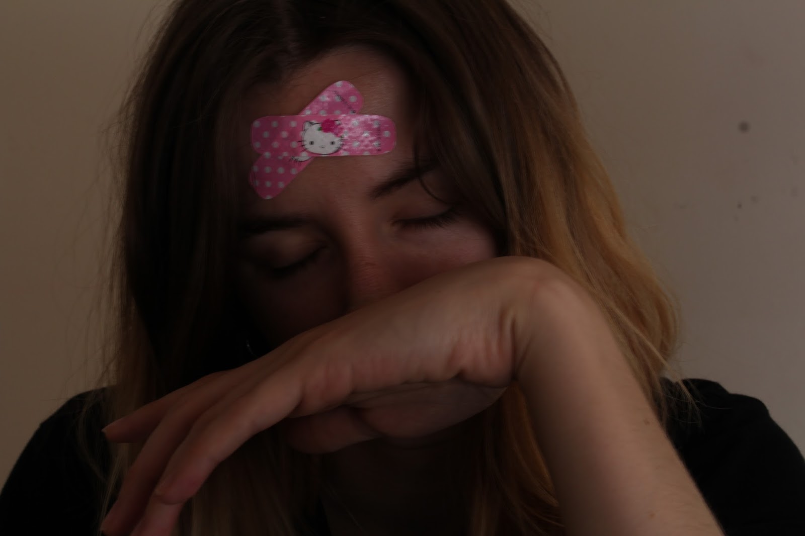
I tried out some of my own images that inspired me looking at this work. I feel my results were less abstract that William Keedy's but I still gave it a go. Below are the images I took:


Although I feel these didn't the abstraction of William Keedy's work, I feel I created my own meaning from what I felt when I looked at his images. I composed my photos the way I did to ensure my head was in full shot to show where the suffering originates from in my body. Plus the fact that I have comical band aids on my head shows that my internal suffering isn't taken seriously and is a joke. In the first image I show only my forehead as I feel sometimes I am only seen by what I suffer with as supposed to the many other things that make up me and my personality. The second and third image shows that I am often not seen or listened to when I am calling out for help, I feel disregarded. I felt that even though my images didn't display the same abstract feel as William Keedy's collection, I feel I brought a new meaning in which I discovered myself. 

Sorry it's been heavy for the first day back. I hope you enjoy. Thank you. 


Tuesday, 9 May 2017

MULTI SCREEN PORTRAITS


RESEARCH
Initially in my research I explored an online digital artist, and all of her works are created around the theme of mental illness or struggling with the digital world. I enjoyed one of her photos as it was a drawing of two people with a yellow circle over their head and their tummy. After seeing this it sparked some ideas as to what i wanted my twin screen to look like. I pictured it ass two screens with one side having a cut out of the stomach and the other a cut out of the head. I felt this was relevant as I could play archived footage through the cut outs I would create, to express how I think and Feel. I then looked into other artists and came across Pipilotti Rist's work, she always produces very beautiful and work with such depth. I was inspired by her dynamic use of twin screens, as the screens are both very different, but when you look more closely you can see that the two correlate. I knew I wanted to create a piece that was inspired from the digital artist I researched, and Pipilotti Rist's work. So, I set about to do that.

PRODUCTION
I had an idea of what I wanted my film to look like, so I set about a day for filming where I would record my head in shot for one of the screens, and my tummy in shot for the other screen. After I was happy with these recordings, I then composed what would come in the background of the cut outs I was going to make in After Effects. For my background piece I used all archive footage from Online, and edited a piece together that I was happy with, and felt it expressed how I feel and think. I then imported my two live recordings of myself and then my background I created. I then went about in separate compositions creating a shape layer over my head and face. I then placed the background piece behind the shape layers to see how it looked. I wasn't happy with the way it looked so I drew round with the roto brush the outlines of my body and Alpha track matted them so they would be inverted. I was a lot more happy with this result as it gave a more abstract look to my work. I decided I would create a new solid as the background as I didn't just want black. I chose a light pink/purple as that is a calming colour for me and I felt the way I feel and think was being displayed on the screen I wanted to show a calm background to balance out and show I can manage how stressful it is for me. Below is my finished product.

I hope you enjoy. Thank you. 

Monday, 1 May 2017

DISPOSABLE CAMERA REVIEW II


Following on from my previous disposable camera, I chose to get another one just to play around with and really try and learn from the not so good photographs on the last roll of film. Overall I feel ok with this roll of film, I don't think it's the best I could have done but in terms of lighting this time, it is a lot better. I am enjoying more and more working with film photography and getting used to being not able to review your photograph straight after which I am growing to like. Below are some of the photos from my second roll of film:


Suburban bloom

Cling on


Ticket office

Coffee


Plant boy

Tropical love

Palm

Paradise

Castle views

West end

Calton road

One wine too many

I apologise for the lack of imagination in the titles, I just hope you like some of the pictures.
I hope you enjoy. Thank you.


Tuesday, 4 April 2017

MULTI SCREEN MOVING IMAGE PORTRAITS (PROGRESSION)


After experimenting with the skills I have learned through the After Effects workshops, I created the look I wanted from my original multi screen idea. My idea is to have two screens of either me or someone else, and mask out their stomach on one screen, and mask out their face on the other. After this I will film clips I want to play through the face and stomach to create how I feel whilst being on my phone. This links with the brief by demonstrating my connection with the digital world. Below are some photos of how I explored this today. It is in the early stages so I haven't filmed anything so all the footage I used was previous work of mine.


As you can see, I imported an image into my new composite and create a circle mask using the shape tool, I then subtracted the mask so the image remained and the mask got rid of the photo. This then allowed me to import a video file and place it in the background, where it was visible through the mask I had just created. Of course this is still early days so isn't as precise as I would want it to be, this is just experimentation.


As for these images I did the same as the top image but created the mask lower, as I don't have a picture with someone's stomach in shot I just used the same image and moved the mask to demonstrate my thought process. However, when I do film my footage I shall ensure that I frame the screens to how I want so I can have the stomach in shot. 

The two screens will link by showing me do similar things but displaying through my head and my stomach how I feel. I find being on the phone weather it is texting or ringing someone quite stressful and makes me very anxious as I don't want to speak to people quite often, I like to be alone sometimes. So showing me text, with what is going on in my head on the screen, and showing me on the phone with what I feel in my stomach is a visual way of me trying to explain the anxiety I feel with digital technology and the digital world. I have chosen to do this subject as a creative way to express my frustration I have with my anxiety, and possibly choosing to express it in a creative way may ease some of the tension I feel. 

I hope you enjoy. Thank you. 

Monday, 3 April 2017

DISPOSABLE CAMERA REVIEW


When doing my portrait series I came across some photographers that I was inspired by, and came to realise that they had used film photography instead of digital. I wrote a blog post explaining how I didn't feel comfortable shooting in film and much prefer digital as I can review the photo on the spot. However, I decided to challenge myself and bought a disposable camera and use it whenever I felt like instead of under pressure to make the experience more fun for myself. I just took the little camera around with me, and instead of reaching for my phone to capture a moment I used the film camera. Overall I feel ok with the photos, I'm not all that pleased with some of them as they are too under exposed or I have taken the photo too close to it just looked washed out. But, this is a learning process so I should be patient with my results. Below are some of my photos from one roll of film:


Suburbia

Lakeside

Demolition

Sunset

Slot machine

Greenery

Botanist boy

Gift shop

Harbour walk

Torquay 

Good morning

Pancakes

Danielle

Cluster

Shake shack

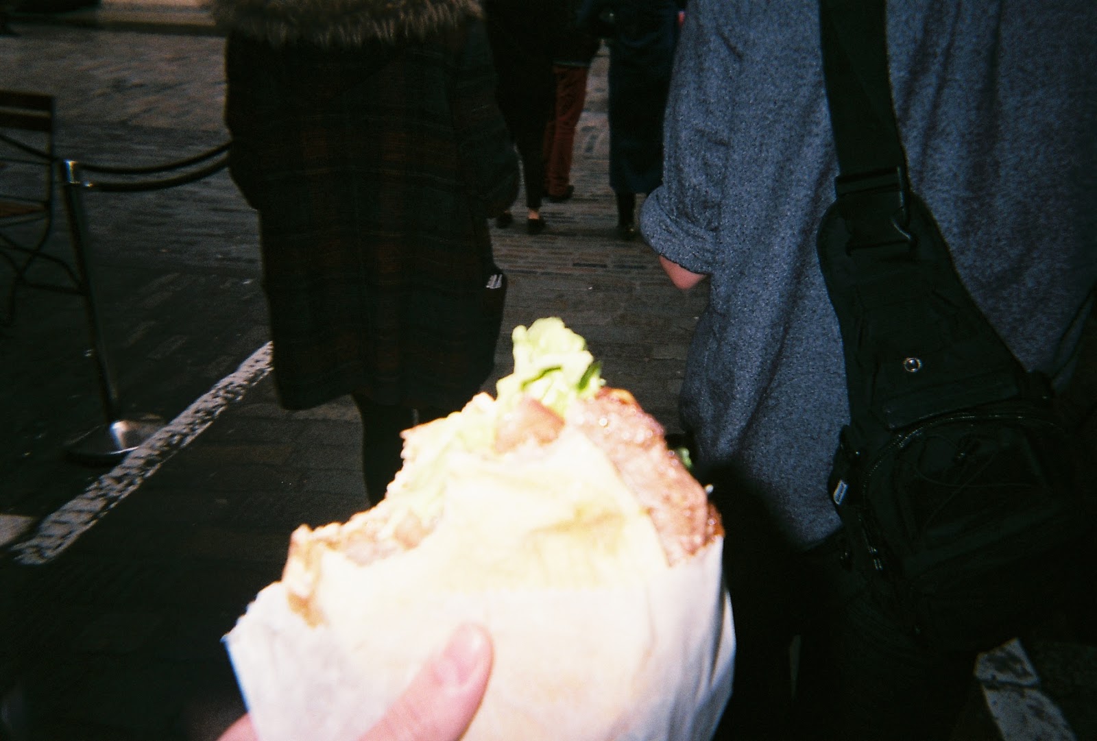
Like I said, overall I feel ok with the photos. I don't feel particularly sad or happy about them as they are a mixed bunch of photos. However, I have noticed what has worked in the ones that are well exposed and shot as suppose to the under exposed ones. 'Cluster' is probably one of the nicest photos as I remember having the sun behind me on a sunny day, with my friends just the right amount of distance from me. The film camera roughly estimates the ISO to be at 400, which I tried to factor in when taking my photos weather flash would be beneficial or not. I noticed that 'Sunset' and 'Demolition' came out quite well, the colours are still saturated and am surprised the camera picked them up from the sky. One of my favourites from the bunch is definitely 'Slot machine' another photography fear or mine is using neon lights in my work, even though I am so drawn to and mesmerised by them, but I love how this had turned out as I feel it has got the arcade lights just right. The photos that I felt didn't go well were 'Pancakes' and 'Shake shack' and I reckon (I'm no expert though) that it is because the items (food) I was taking photos of were too close to the camera and the flash, therefore just washed the image out completely, losing any colour from what I wanted to capture which is a shame but it happens. Overall though I think it was a good thing for me to experiment with in my own time as it took away the pressure for the photos to be perfect. I would try this process again in the future as I feel I have learned what works and why and what doesn't work and why which is the most important part of this experiment. 

I hope you enjoy. Thank you


Thursday, 2 March 2017

FINAL SELECTED PORTRAITS: FIORIRE


Here are my final portraits for the Identity series: 

Stripe

Mint

Time 

Quiet

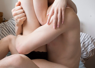
My motivation for this series of portraits was quite simple. I adore the look of skin on camera, capturing it in just the right light to make it look so soft and beautiful. I also wanted to capture my relationship between my partner and I. I wanted to show our intimate moments together without it being sexual and just with very carefully selected lighting. I chose to only shoot between four hours of the day (10am-2pm) to achieve the soft light I achieved in my photos. Also having a photo of my partner and I individually I wanted to show that we are individuals too, and that we come together and a unit. My initial ideas we to shoot my pictures candid and just have my camera ready at any moment we were together. However, I wasn't getting fast enough results or what I really wanted, so Anne suggested that I stage the photos so I can control everything and make the appear candid. I decided to give this idea a go and my results were far better and was producing more work. I quite enjoyed controlling the seemingly candid photos as it meant I had full control of composure and lighting and this gave me satisfaction that the photo would turn out well. I wanted to highlight through post production the places in which our bodies come in to contact to enhance the senses of we we touched. 

For my research I wanted to find some work of a similar nature to mine and I looked in the book Auto Focus I found a series named My Little Dead Dick which was a collaborative piece between Patrick Tsai and Mdi Ju. The collection is simply gorgeous as they photograph their intimate time together. I was so inspired by their work I wanted to try and get a similar candid look with my photos. However, one strong difference between their work and mine is that they used film photography to create the beautiful saturated colours. I just loved seeing how strongly you could feel the intimacy in the photos without it having to be sexual. Another photographer I researched was Igor Prorrt. A friend of mine saw his work and recommended him to me, and specifically a series named Betelgeuse. Upon looking at his website filled with his work I fell in love. The lighting in his photographs was beautiful, so delicate but so soft and touching in the series. On reflection of these photos I learned and can see he used a lot of artificial lighting to create these wonderful shots, but I still adore them and their composure. For portraits they are quite unusually composed, he often has his face away from the camera and close ups of body parts with him and his partner. I liked the uniqueness to his work and took inspiration for my photos in composure and lighting.  

When shooting my photos there were some challenges, it wasn't all an easy ride. For instance, when photographing the picture of me in the bath I had to try and make sure you couldn't see the reflection of the camera in the side of the bath. I saw this as an issue and framed it so you couldn't see it. Also with the photo of my partner across my lap it was hard to take the photo as I was having to hold the camera from above and hope for the best, This meant we had to take multiple shots in order to get the framing exactly how I wanted it. For the portraits together brought new challenges. The photo in the bathroom I wanted to show there was a mirror behind us but not get the camera in reflection,so I had to frame this carefully and position us so we would block the camera's reflection. For the photo of us on the bed, I had to set the focus and desired framing with my partner in shot, then press the timer on my camera and run back into shot. This meant we had to take quite a lot of photos before I was happy with one, but it was worth it in the end. We also had to balance the camera on a radiator which was switched on so time was of the essence. I also had to settle on a name for the series and that brought new challenges because I felt I couldn't simply sum up the series with a title. However, I took my time thinking and researching and settled on naming the series Fiorire. Fiorire means to flourish or to blossom in Italian, and since I have Italian in me and in my family, I felt this was fitting and gave a new intimate level into my life and the series. 

In terms of post production techniques, I set out with the idea that I was going to select the places in which we came into contact with each other and alter the hue. I personally felt this would look good and give good results because it would draw the viewers eye to the colour change in parts of our body to make you think about the touch and contact we have, enhancing that feeling of intimacy. However upon doing this in PhotoShop I wasn't happy with the results as they ended up looking alien like and taking away the natural intimate feel to the photos, which is what I wanted in the first place. So I spoke to Anne and made the decision to submit the photos as they were as I felt happy with how they looked, manipulation free. 

Personally I have thoroughly enjoyed this portrait unit, I liked the freedom of producing more than one photo and how creative we were allowed to be. I feel there are many strengths in my series as I took a lot of time and hard work creating and selecting them. I made the decision to start taking photographs as soon as the brief was given to us, so this allowed me plenty of time to get the results I wanted without being under the pressure of time. I am also quite proud of my lighting too, I feel even though I am very strict with the times I shoot in the day it really does pay off for me. I see good consistent results by being very strict with my shooting routine. Also with starting to photograph in plenty of time this gave me more flexibility when it came to framing as I could dedicate the whole four hours to achieving one photo, so I could move slightly left or right and get it just perfect. Being a perfectionist I feel this is the way I should start working in future project so I have enough time to really perfect my work. I feel I achieved what I set about doing in my series from the beginning. I personally feel and see intimacy in my photos even if I was a viewer and not just the producer of the work. I feel you can see a connection between my partner and I that is intimate and loving without being too overpowering. However, there are always areas to develop on in any piece of work. I feel I could develop, explore or expand my series by trying out a whole shoot on film camera. As my initial photographer research was on a whole series just shot on 35mm film, I feel I could have done this and seen if my results looked as saturated and warm as the photos I researched. I have always been a bit afraid of photographing on film as you don't have the reassurance that you can check to see if the photo looks good. But I feel I should push myself more and try it out, even if all the results weren't what I wanted, at least I could show that I had tried. I am considering using just film cameras if we have another portrait series to really challenge my skills. 

Overall though I have learned so much from this unit of work, I have learned even more on composure through research into other photographers, I have explored and perfected my lighting through research and experimentation which will help me in any future photography.I have also realised the importance and significance in series of photos instead of just one and how it can tell a story and give the photographer and audience more space to explore running themes through the photos. I have also learned how to mount on foam board which I have never done, but will do again as the results give a beautiful finish to my work. 

I hope you enjoy. Thank you. 

MANIPULATED PORTRAITS


With this portrait series we had to manipulate the photos using Photoshop. So I thought about what I could do on Photoshop that would enhance my portraits. As I have used only natural lighting in my portraits I wanted to let in a bit of colour to maybe draw attention to a certain element of the photo. So I came up with the plan of selected points on my partner and I's body that came into contact with each other or something else. However, my skills on Photoshop are very limited as I have only used the software a handful of times, so had to do some research before so I could create the look I wanted without my skills stopping me.


I imported the photos into Photoshop and selected our hands and parts of our arms that were in shot and adjusted the hue so it was a lilac colour. I chose this colour because it is quite soft, subtle and not to overpowering in the photo. I decided to manipulate the photos in this way because I am trying to display the emotional and physical affection, I wanted to show the points of contact my partner and I feel the most when we are together. In this picture it happens to be with our hands, the feeling of running your fingers over someones skin is unexplainable and just wanted to highlight that in the photo. 


With this picture I decided to highlight my hands to enhance the senses. As sensory stimulus is so important to everyone and i feel it so intensely in my relationship. I decided to choose the same colour as to make sure that there is a continuation and link between the photos and what I have done to them. Sometimes feeling something through your fingertips can change the way you feel, such as hot and cold things or things that make you calm. 


I carried this process over to this photo too with the same colour. I am not as happy with this photo and my manipulation with it because I feel it distracts you from the image instead of enhancing it. 


With this photo came new challenges because our hands weren't in shot. But nevertheless I worked my way around it. I decided to highlight and change the colour of my knees as that was the point of contact visible between my partner and myself. I am not quite sure if I enjoy my manipulation in this image as I feel it takes all naturalistic qualities and intimacy away from it. 

I thought about possibly changing the highlighted pieces in the images to black and white instead, but I felt like that would bring a negative feeling to the picture. i felt that colour would make it appear more positive but I am unsure as to weather I chose the right colour. After exploring manipulating my images I have decided to submit, print and mount my portraits with only a little touching up on exposure and not with the change in hue and selection. This is because I feel the manipulation takes the naturalistic look and intimate feel away and focus on the colour which wasn't my aim. 

I hope you enjoy, Thank you. 


Monday, 20 February 2017

THIRD TEST SHOOT


To wrap up my series ready for printing I decided to do one last shoot. For this shoot I had more of an aim than with the others, as I wanted a picture of me and my partner together, as I have selected two photos already one of each of us, I decided we needed a photo together to create a link to the two individual photos of us. I wrote down a list of scenarios I wanted to explore and create so we set aside a morning to try and complete them when the lighting was just how I wanted it.

In the first scenario I wanted us to be together doing something we enjoy together which is brushing our teeth. So we set the camera up in a few different ways and here are the results:


Clean

Mint

The first photo 'Clean' I took inspiration from my initial portrait research as they took a photo in a mirror together and it really worked. In the photo it still felt candid even though it was making you aware the camera was involved. So I tried to make that idea my own. I quite like it, I like the framing and the lighting a lot. I still feel it appears candid without the camera intruding on the intimacy. My only negative is that the mirror was still fogged up so it isn't as clear as I would have liked, but I could avoid this next time by waiting until it was clear. The second photo 'Mint' is probably my favourite. After me and my partner brush our teeth we like to kiss, it's something we have always done and just feels intimate. Again I can appreciate the lighting and framing, although I would like to possibly straighten the image as the camera was balancing on a towel rail. 

In my second scenario I wanted to capture our intimacy skin to skin without it being sexual. We enjoy just holding each other and it feeling so special without any sexual connotations to any of it. I wanted to try and see how we could create this by experimenting. Here are the results:


Touch

Stripe

Minute 

With the photo 'Touch' I wanted to capture the feeling of skin on skin when we lay together, it's such a relaxing and safe feeling. However when I first started this process I didn't want any of our tattoos being in the photos as I feel it directs the focus to them instead of the photo. Thus I am disappointed in the way I framed that on that image and should have taken more time to set the framing up right. The second image 'Stripe' I really like, I feel the exposure is just right and I enjoy the framing as it is very central but doesn't give away our faces. Even though all these pictures are set up, I still feel they appear candid. As for the last photo I thought it would be nice if we had a little more of our faces in, again I can appreciate the exposure, however the back drop I don't enjoy as much because I had to zoom out to get our faces in, and then allowing my chest of draws in shot. But maybe that is something I can adjust in PhotoShop or work on in the future with my framing. 

I hope you enjoy. Thank you.