Showing posts with label photography. Show all posts

Sunday, 25 March 2018

ADVANCED PHOTOG (INKJET PRINTS)


For one of the tasks we were asked to print out two images on A3 photo paper of our choice. We had recently been inducted into these printers and the monitors and I was looking forward to printing. There was a lot more to remember than I thought and it took a long time to print. But firstly I went and got some photo paper from the print bureau, I decided to do some test prints too to male sure I was happy with how the image was printed and it was on the paper I felt suit it the best. So I switched the printer on, I did a nozzle check to make sure all the inks were topped up and ready to use. Then I opened the images, gave them a final tweak as we were allowed to use the expensive monitors for editing the pictures. The monitors allowed you to take in the light of the room and create a preset for you to edit in, based on the sunlight around you. We were asked to print one studio shoot image and one light source of our choice. I decided to print my light source first and got to work with setting the computer up ready for printing. You had to first select the size and orientation of the paper, then the type of paper you were printing on so that it could adjust the inks to the paper. Then chose if you wanted it colour metric or perspective. I chose for both images colour metric as I felt in my test prints that they came out the best in terms of colour. I put my paper in carefully, and decided to try and print on matte paper first. When it was finished, I had a look at the print and firstly it was far too dark, and secondly I wasn't as happy with the paper choice as I thought in the beginning. So I decided to go back into Photoshop, adjust the brightness so it would print more clearly, and I went and got some satin paper. I had to change the settings again in the printer view to ensure it knew what paper the image was being printed on. I was a lot happier with this result and pleased with the outcome so now it was time to print my studio shoot image.

I thought with my studio shoot image that I would like to print on glossy to give the image a glow and shine to the image. I got the printer all set up again, but making sure to change the type of paper the image was being printed on. I then set to work loading the printer to make sure the paper was the right orientation and going to print on the right side instead of the back of the paper. I then went for it and printed my image. I again chose colour metric because I felt the colours worked best for the images I was printing. It came out and I was actually super happy. The exposure was just right and I really like the way it looked on the paper. I was really happy with the image and because it came out perfect the first time I didn't feel like it needed another print on some different paper.


I hope you enjoy. Thank you.

ADVANCED PHOTOG (LIGHT SOURCES)


For one of the tasks we were asked to take photos of five different light sources. At first I was a little stuck as I couldn't think of five, but after having a talk with some friends I realised that there were loads. I wrote down what I wanted my five to be. I knew I wanted candlelight, as I have a lot of candles and felt I could compose the shot nicely. I felt also that maybe not everyone would take a picture of candlelight so it might be a bit refreshing to see. I am happy with this image as I feel the composition is executed well, as is the exposure. Luckily none of the images had to be portraits so that made things a little easier. My second image was daylight. I had taken this picture a while back when I was in my living room drinking tea, so I felt like this was a good one to use. I have edited it a little bit to get rid of some spots on the lenses and make it look a bit cleaner. But know I am happy with the result.The third image I took last winter when I went to a funfair. I feel funfairs at night are always great photo opportunities and am very happy with the result, for a shoot and go sort of shoot I was doing that day, I feel that the composition, exposure and lighting a really well done. My fourth image is a test shot I did in the studio of my friend Nina. We were playing around before any of our models came in and took a few pictures with Nina in the fur. I find this image very beautiful, mainly because of the model but also I feel the lighting, focus and exposure are spot on and I am actually very proud of the photo. Finally, my sunset picture. I took this when I went away last summer to Bristol, we were about to leave the apartment we were staying in when I turned round and saw the way the light hit the sheets and the bed and had to take a photo. This was also the image I chose to print as I felt it would look lovely and textual when printed on satin paper. I am really happy with all these images even if they needed a little work done on them. But having to do some editing on them has expanded my knowledge in Photoshop.


CANDLE LIGHT

DAYLIGHT

NEON LIGHT

STUDIO LIGHT

SUNSET

I hope you enjoy. Thank you.

ADVANCED PHOTOG (LIGHTROOM CATALOGUE)


As one of the tasks for Advanced Photography we were asked to create a primary and secondary Lightroom catalogue. We spent a whole lesson with Bayton going through step by step what was needed in our catalogues and how to execute it well. We were asked to create collections in our catalogues, give our pictures colour and star ratings, edit them, and give them keywords to search for in the search bar. Below I have taken screenshots of my work flow and pieces of editing I have done along the way.


Above you can see that I opened my image as a smart object therefore any work or editing I did to the photo, it linked back to my Lightroom catalogue, and inserted a new image with all the changes I had made to it.

As you can see above I created my 3 collections, and in my light source collection I had made a start on rating them and colour rating them. One thing Bayton told us in class is that a good work flow is to make all your newly imported pictures coloured red, meaning you haven't edited them, orange if you had made a start, and green when the image is complete.

Above is a screenshot of me demonstrating me opening an image as a smart object into Photoshop. 

Above you can see that when I open the image into the camera RAW view, I have made changes to how the image is imported and displayed. I chose 16bit for my image and changed the present from adobe to Prophoto.

You can see here that I am starting to make changes and edit my images slowly.

Again you can see the changes I am making to my image to make it look better.

Here I have taken a snapshot in Photoshop so that Bayton will be able to see what and how I have edited my pictures.

As you can see here I am showing you the beginning of my light sources collection, where everything is coloured red, and my star rating is how good I deem the image without any editing.

This is my personal collection at the beginning of me editing anything.

Again this is my studio shoot catalogue at the beginning of the editing stage.

Pictured here I am displaying that when you make changes to your image in Photoshop as a smart object it relays any editing back to your catalogue and creates a duplicate. You can also see in the bottom right hand corner the little icons show that I have created key wording for them, colour labelled and star rated them.

Here you can see my workflow as I start to make progress on an image.

I hope you enjoy. Thank you.


Friday, 2 March 2018

DANCE FILM: INSPIRATION (PHOTOGRAPHY)


I feel that any form of media or anything in this world can inspire our work. Weather it be an experience, or a place or piece of work. But I took inspiration from a photographer called Todd Hido. Even though you may not assume any of his work inspires me, I feel that his composition and lighting does. Being a lighting fanatic I am obsessed with his dark, sunset style lighting. Most of his work appears like it is small towns, surrounded by snow and isolated it gives the feeling of isolation and sadness as there is a lot of blue sombre tones to his work. Because he photographs houses a lot in the bleak winter there is often a light on in the house. Some could say there is a light on simply because someone occupies the building, but I think the light has been turned on purposefully to signify a light of hope, or life in a building or event. I feel this could be quite useful in my choreography to try and replicate this sort of feeling in my work. Pictured below are some of his works.


Thursday, 1 February 2018

LARGE FORMAT CAMERA INDUCTION


On Wednesday Peter Renn held an all day workshop on large format cameras, under the Fields and Frames unit. Beforehand I was really excited as I had never used large format before and I wanted to know how it looked and worked. Peter gave a presentation in the morning of famous photographers that use large format and why. We were shown some beautiful examples of large format work and it was incredible. The quality and definition you can get in the photo is incredible, and this allows you to be able to enlarge the images easier.

After the presentation, Peter got out some large format cameras and showed us how to set them up and make sure they aren't damaged and in good working order. He also told us what to book out if we ever need one, as when you book out a large format camera and a tripod, it doesn't come with the film paper slots, so you have to book them out separate. The setting up of the camera itself was fascinating, the care and time you take over the camera is important as it is delicate. We were also shown how to load the film, and how to set the camera up to take a picture. This was a lot of information to take it, but luckily I wrote notes. We were then reminded on the light meters and how they will come in handy whilst shooting. After this, Peter gave us some film paper and sent us off to take pictures of whatever we wanted and experiment. We got into groups and my group was me, Nina and George. we decided to go around uni and try and take a self portrait in the reflection of a window. but we accidently exposed the paper so it went completely white instead of capturing the photo. Sadly George had to leave so it was up to me and Nina to see if we could figure out how to take a photo and it work. After multiple attempts of it being over and under exposed we finally got there, and started to shoot some really pretty photos. I think it was easily one of the best and most fun workshops I have been to, I enjoyed the laid back manor and Peter allowed us to play and experiment and capture whatever we wanted. Pictured below are some of the camera and process.

Photo Paper

Failed Self Portrait

The Camera

The Viewfinder 

Darkroom

Behind The Scenes

Behind The Scenes II

I hope you enjoy. Thank you.

Tuesday, 26 September 2017

ARTIST RESEARCH: SHIRIN NESHAT


Shirin Neshat is an Iranian born artist, with running themes of juxtaposing ideas in her work. Some of these themes include, Islam and the West, femininity and masculinity and public and private life.

During first year, we were shown some of her work, photography and video and it had an incredible impact as it has such deep and political meanings. One of her most famous pieces of video work that I enjoyed was Turbulent, this is a dual screen piece in which we watch a man sing what I assume is a traditional song, with a full crowd watching with his face to the audience. On the other screen is a woman, singing what can only be described as sounds, which seem to not sound like words, facing the audience with no one in the crowd. This is displaying Identity quite clearly. Neshat also has a lot of work around the oppression women feel in Iran and this is show in Turbulent. The man on the left screen is singing with a crowd listening; whilst the woman, has no one in the audience and isn't saying any words, almost as if she isn't allowed an audience to voice herself.


Neshat also does photography work and has created some wonderful and moving pieces of imagery with some calligraphy work too.  She created series of images that are sacred parts of peoples bodies. Such as their faces, hands for praying, and feet for walking on. These were shot in black and white to display the hardship and depth of what Neshat is trying to display. As she is well known for her political and identity themes I feel this is displayed very clearly through these three images. Showing that your identity is what you say and your religion and that it is displayed on your body. Having words from the Quran on your face is an incredible political statement and one that could liberate women in Islam which is what Neshat is trying to do. 


Monday, 18 September 2017

SUMMER PROJECT


For the summer we were presented with a project to plan and develop an installation to have a politically aware agenda. I decided to base my installation around mental health and the seemingly unknown hidden life about it. Struggling with it myself, I feel I am not taken seriously by doctors and the NHS of everyday symptoms and how it can drastically change all aspects of your life. Of course, if you had a broken leg, a visible injury, then you would be seen to straight away at the hospital to get it fixed. However, I feel because mental health suffering is often primarily internal, you are not taken seriously as know one can see inside as to what is going on. 

Anyway enough about me. I found some incredibly moving and touching photography surrounding the same themes and ideas I was looking at and felt like this could inspire my own work and instillation. The artist is called John William Keedy and he has produced a series of work that resonated with me particularly, it is titled "It's Hardly Noticeable" I would like to share some of the images with you know and explain why and how they resonated and inspired me.


All four images are from the same series. What I like about them so much is that they are subtle in showing displays of suffering. If you just so happened to see these images without knowing the meaning and title behind the series, you wouldn't associate them with mental illness and suffering. What I like about these pieces is they're very unique. Many artists who try and capture mental health, often tackle it head on with images of people appearing sad, or in black and white and things of a similar nature. However William Keedy has captured life in colour, and shows the everyday struggle of mental illness and sufferers trying to go about their daily life. They show a sense of overwhelming things that seem trivial to someone who doesn't suffer. Having to remind yourself to be good as you leave the door as reassurance against your mind that wants to battle you. Overwhelming things being delivered or trying to be contacted when all you want to do is shut yourself away. 

I feel that these sorts of images would be best displayed in and around a city, on sides of buildings or posters. I feel this kind of abstract but relatable imagery to those who suffer could be reassuring and liberating that they're not the only people who feel overwhelmed by everyday life. It could hold a positive meaning and where lots of people come and go everyday can see it. This could liberate the stigma I would hope, and allow people to talk about their everyday suffering which is still a big part of people's lives. 

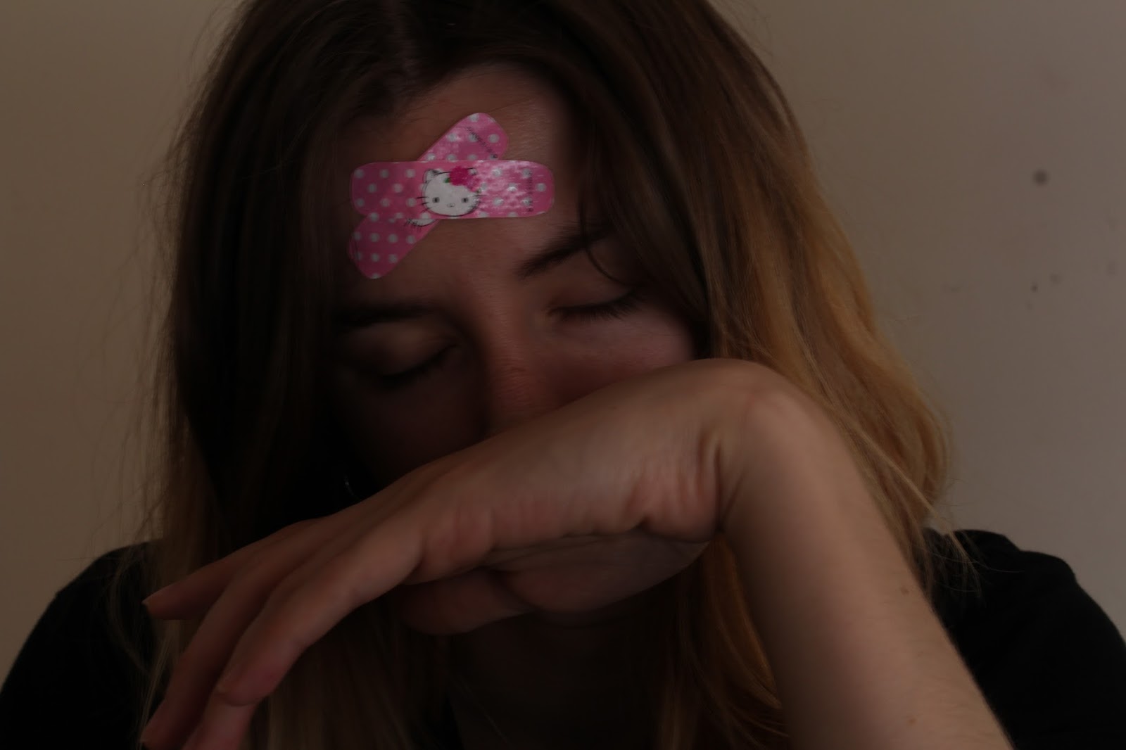
I tried out some of my own images that inspired me looking at this work. I feel my results were less abstract that William Keedy's but I still gave it a go. Below are the images I took:


Although I feel these didn't the abstraction of William Keedy's work, I feel I created my own meaning from what I felt when I looked at his images. I composed my photos the way I did to ensure my head was in full shot to show where the suffering originates from in my body. Plus the fact that I have comical band aids on my head shows that my internal suffering isn't taken seriously and is a joke. In the first image I show only my forehead as I feel sometimes I am only seen by what I suffer with as supposed to the many other things that make up me and my personality. The second and third image shows that I am often not seen or listened to when I am calling out for help, I feel disregarded. I felt that even though my images didn't display the same abstract feel as William Keedy's collection, I feel I brought a new meaning in which I discovered myself. 

Sorry it's been heavy for the first day back. I hope you enjoy. Thank you. 


Tuesday, 9 May 2017

MULTI SCREEN PORTRAITS


RESEARCH
Initially in my research I explored an online digital artist, and all of her works are created around the theme of mental illness or struggling with the digital world. I enjoyed one of her photos as it was a drawing of two people with a yellow circle over their head and their tummy. After seeing this it sparked some ideas as to what i wanted my twin screen to look like. I pictured it ass two screens with one side having a cut out of the stomach and the other a cut out of the head. I felt this was relevant as I could play archived footage through the cut outs I would create, to express how I think and Feel. I then looked into other artists and came across Pipilotti Rist's work, she always produces very beautiful and work with such depth. I was inspired by her dynamic use of twin screens, as the screens are both very different, but when you look more closely you can see that the two correlate. I knew I wanted to create a piece that was inspired from the digital artist I researched, and Pipilotti Rist's work. So, I set about to do that.

PRODUCTION
I had an idea of what I wanted my film to look like, so I set about a day for filming where I would record my head in shot for one of the screens, and my tummy in shot for the other screen. After I was happy with these recordings, I then composed what would come in the background of the cut outs I was going to make in After Effects. For my background piece I used all archive footage from Online, and edited a piece together that I was happy with, and felt it expressed how I feel and think. I then imported my two live recordings of myself and then my background I created. I then went about in separate compositions creating a shape layer over my head and face. I then placed the background piece behind the shape layers to see how it looked. I wasn't happy with the way it looked so I drew round with the roto brush the outlines of my body and Alpha track matted them so they would be inverted. I was a lot more happy with this result as it gave a more abstract look to my work. I decided I would create a new solid as the background as I didn't just want black. I chose a light pink/purple as that is a calming colour for me and I felt the way I feel and think was being displayed on the screen I wanted to show a calm background to balance out and show I can manage how stressful it is for me. Below is my finished product.

I hope you enjoy. Thank you. 

Monday, 1 May 2017

DISPOSABLE CAMERA REVIEW II


Following on from my previous disposable camera, I chose to get another one just to play around with and really try and learn from the not so good photographs on the last roll of film. Overall I feel ok with this roll of film, I don't think it's the best I could have done but in terms of lighting this time, it is a lot better. I am enjoying more and more working with film photography and getting used to being not able to review your photograph straight after which I am growing to like. Below are some of the photos from my second roll of film:


Suburban bloom

Cling on


Ticket office

Coffee


Plant boy

Tropical love

Palm

Paradise

Castle views

West end

Calton road

One wine too many

I apologise for the lack of imagination in the titles, I just hope you like some of the pictures.
I hope you enjoy. Thank you.